
Tap targets are more than a buzzword in today’s digital landscape. But what exactly are tap targets, and why should you, the everyday web surfer or burgeoning web designer, care about them? Think of tap targets as the buttons and links that you touch when navigating websites on your phone or tablet.
These targets are vital for ensuring a smooth, frustration-free online experience. Let’s delve deeper into understanding why tap targets should be on your radar.

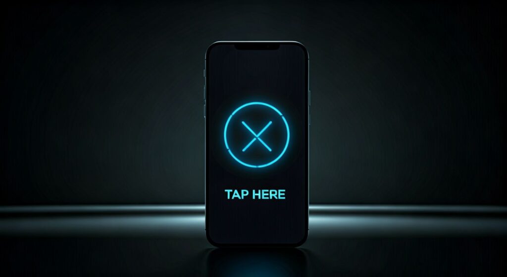
In an era of mobile surfing, tap targets play a huge role. Our patience runs thin when dealing with websites that require microscopic precision just to hit a button. Ever try zooming in to tap a link and accidentally clicking the wrong one? That’s because the tap targets were too small, and believe me, you’re not alone in your frustration.
Also see: Google’s Mobile-Friendly Website Guide
The effectiveness of tap targets can make the difference between a pleasant visit to a website and an experience that makes us throw our phones in exasperation.
Mobile users, who often juggle multiple tasks, need tap targets that are sizable and easy to hit. Without them, frustration builds, and people leave your site faster than you can say, “Where did they go?” Larger, well-placed tap targets enhance user satisfaction and can even improve conversion rates. Think of them as the friendly doormen to the otherwise intimidating skyscrapers of the digital universe.
So, how do you design tap targets that make your site the belle of the ball? Let’s break it down.
When it comes to tap targets, size absolutely matters. Standards suggest a minimum size of around 48 pixels for touch elements. This ensures users with all finger sizes can comfortably interact with your website. Imagine trying to catch a rolling cheese wheel—smaller targets move too fast for our fumbling fingers. But bigger targets, they slow down the chaos.
Yet, while size is crucial, consider the space around tap targets too. Crowding them creates confusion, leading to misadventures. Space them well, much like setting a dance floor with ample room for everyone to groove effortlessly.
Equally significant is the placement of these tap targets. They shouldn’t be scattered like jigsaw pieces. Logical, predictable placement helps users intuitively know where to tap, keeping their attention and reducing the cognitive load on their brains. Remember, nobody wants a digital treasure hunt when all they’re looking for is the map.
Tap targets should also offer feedback—perhaps a subtle colour change or a gentle vibration. Feedback reassures users they’ve successfully hit the target, like a little nod of affirmation from your website, saying, “You got it, boss!”
In our fast-paced digital world, tap targets reign supreme as unsung heroes of web design. Bigger and better-designed targets not only improve user experience but also keep visitors coming back for more. They’re like the dependable sidekicks making sure your website is easy to navigate, especially for those of us with less-than-dexterous digits.
By focusing on optimizing tap targets, you’re wielding the power to transform your website into one that’s user-friendly, accessible, and ultimately, a joy to explore. So, next time you’re on your phone, pay attention to those tap targets—they just might be the most important part of your digital journey!


Copyright © 2022 - 2026. Tresseo. All rights reserved.